01
Home
HOMEStart with a scene.
Discover the brand through real applications and find relevant products.
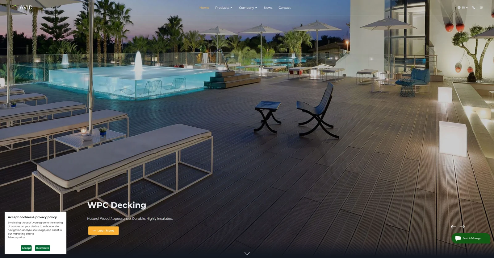
- Applications
- Brand story
- Categories
From imagined spaces
to material choices.
A building-materials website · Structure & visual design
Explore the case ↓AVID presents WPC composite materials and building products to overseas audiences. The website brings together product information, supplier credentials and ways to start a conversation.
Responsible for site structure, page layouts, visual direction and image preparation; collaborating with an external development team for technical implementation.
Organising page types and content relationships.
Defining module order, image proportions and reading hierarchy.
Connecting spatial imagery and material presentation.
Preparing imagery for use across the website.
A PRODUCT-LED STRUCTURE
Connecting product selection, company information and enquiries.
A clear next step at every stage.
Discover the brand through real applications and find relevant products.
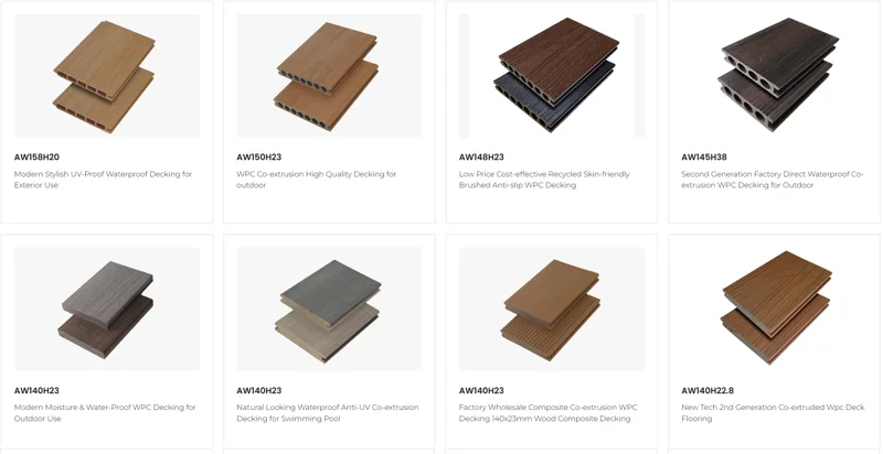
Explore categories, models and specifications to refine your selection.
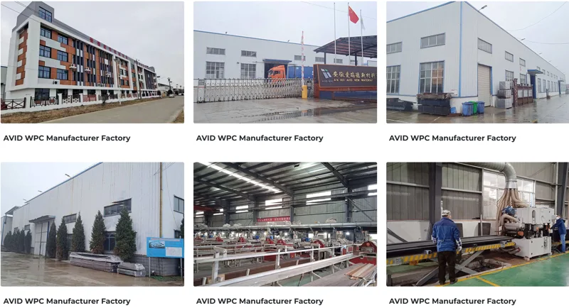
Review the factory, credentials and services to assess the supplier.
Follow exhibitions and company updates for the latest brand news.
Find contact details and share your product requirements or enquiry.
These are peer navigation sections. The journey is illustrative; visitors can also enter directly through a product page.
Large scenes establish the first impression, while darker sections carry the brand story. Application imagery, product close-ups and material swatches reveal different layers of information.
Colours illustrate the relationships observed in the original website.
Categories, model listings and product details each carry a distinct information task. The sequence moves from visual discovery towards specific product comparison.
Consistent views and light backgrounds bring material colour, texture and cross-sections into focus.
Product form, colour, dimensions and materials are grouped alongside the Get Quote entry point.
Company introductions, factory imagery and certificate documents add supplier context. The contact page brings communication channels together.
Contact details, a map and a form are organised into distinct areas to support the next conversation.
These views demonstrate layout; no unverified enquiry or conversion outcomes are claimed.
Multiple stakeholders took part in reviews, and some designs were changed or set aside through feedback. The experience sharpened my attention to shared criteria for design decisions.
Agree on audience, key information and page purpose before visual exploration.
Group feedback into content, structure and visuals, then establish priorities.
Confirm direction at structure, visual language and key-page stages.
These are recommendations from retrospective reflection. This case draws on supplied website screenshots and role descriptions; engineers completed website development.